“If a click makes money when you’re confused, it was designed that way.”
If a website makes you feel clumsy, that’s not an accident—that’s margin. Dark UX isn’t “bad design,” it’s profitable friction: buttons that guide your thumb, copy that shames your “No,” paths that open like a slide and close like a vault. You don’t need a degree to spot it; you need a stopwatch and the nerve to say it out loud. Below: a 90-second field test, a receipts kit, and the red-flag glossary—so you can prove it, not vibe it.
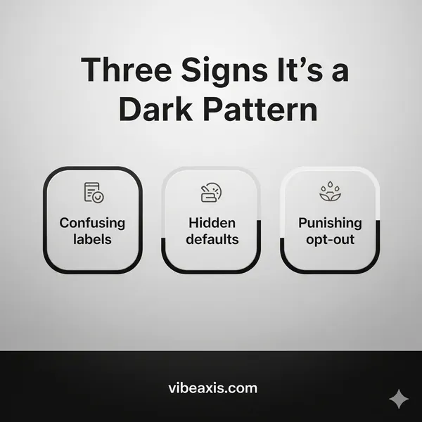
If it steers or traps, it’s a pattern, not a mistake.
Label the tactic (Roach Motel, Confirmshaming, Misdirection) and attach receipts
If ≥2 red flags, record it and bounce. Proof > vibes.
The 90-Second Dark-Pattern Field Test
(Do this on any sketchy flow.)
Intent vs. Outcome (30s).
Write the sentence: “I’m here to ___.” Click through once. If the interface keeps redirecting you to a different outcome (trial, upsell, data grab), you’ve got Intent Inversion.
Choice Cost (20s).
Compare the effort to accept vs. decline. If No takes more taps, more scrolling, or hides behind soft-contrast text, that’s Obstruction.
Timer & Tally (20s).
Start a timer. Count how many times the site interrupts you before you can do the thing. >2 interruptions? Nagging and Interruption Pricing (they’re taxing your attention).
Undo Test (20s).
Try to reverse the last step (unsubscribe, cancel, delete card). If “undo” is harder than “do,” that’s the Roach Motel.
Red-Flag Glossary (with telltale receipts)
Use these labels in your screenshots. It turns “this feels wrong” into evidence.
Roach Motel — Easy in, hard out. Receipts: Unsubscribe hidden behind 3+ pages; cancel requires chat or phone; downgrade linked as “learn more.”
Confirmshaming — The “No” option is guilt-bait (e.g., “No, I hate saving money”). Receipts: Asymmetric copy, sarcasm in the decline button.
Obstruction — The hard choice costs more taps/scroll/typing. Receipts: “Decline all cookies” inside an accordion; tiny text, low contrast.
Sneaking — Stuff added without consent. Receipts: Auto-checked add-ons, “protection plans,” newsletter toggled ON by default.
Bait-and-Switch — The headline promise changes mid-flow. Receipts: Coupon applies then disappears at payment; price jumps after “fees” reveal.
Nagging — Repeated popups “Are you sure?” “Limited time!” Receipts: Same modal twice; blocker overlays after you already declined.
Misdirection — Visual weight pushes the profitable choice. Receipts: Giant neon “Start Free” vs a hairline “Continue without.”
Trick Questions — Double negatives/opt-out gotchas. Receipts: “Uncheck to not receive marketing.”
Privacy Zuckering — Herd you into over-sharing. Receipts: “Allow all” is one tap; granular controls buried.
Fake Fast — The UI looks done, but can’t act yet. Receipts: Buttons “load” but don’t bind; totals update seconds later; skeleton screens stall.
Receipts Kit (how to prove it in 3 minutes)
You are not complaining; you are documenting.
Screenshots (sequence): each step, with cursor/selection visible. Circle the forced choice.
Screen recording (30–60s): start from the landing page; narrate once: “Trying to cancel; three blockers so far.”
Timecode: include your stopwatch overlay or note timestamps in captions.
Before/After Price: capture the price at product page vs checkout (fees, add-ons, auto-tips).
Copy/Paste the exact microcopy. That shaming line in a button? Put it in text under the image.
Accessibility tell: Tab through the modal. If the No option is skipped or focus is trapped, it’s deliberate.
Bonus nerd move: In your browser’s DevTools → Network, throttle to “Slow 3G” and reload. Fake-Fast patterns jump out when the spinner has to lie longer.
Dark-Pattern Smell Tests (quick heuristics you can run)
Contrast Flip: Screenshot. Desaturate to grayscale. If the “No” option disappears, it’s on purpose.
Target Size: If the “Accept” button is thumb-sized and “Decline” is link-sized, that’s intention.
Symmetry Check: Count steps to say yes vs no. If no > yes, it’s a tax.
Reversibility: Try the back button. If it dumps you somewhere unrelated (or re-adds what you removed), you’ve caught Undo Hostage.
The Dark-Pattern Bingo (keep it in your head)
“Free trial—credit card required.”
“Limited time—always extended.”
“Call to cancel” (but sign up online).
“Shipping protection” auto-checked.
“Continue” vs “Continue without” (low contrast).
Cookie banner where “Save choices” is not Reject all.
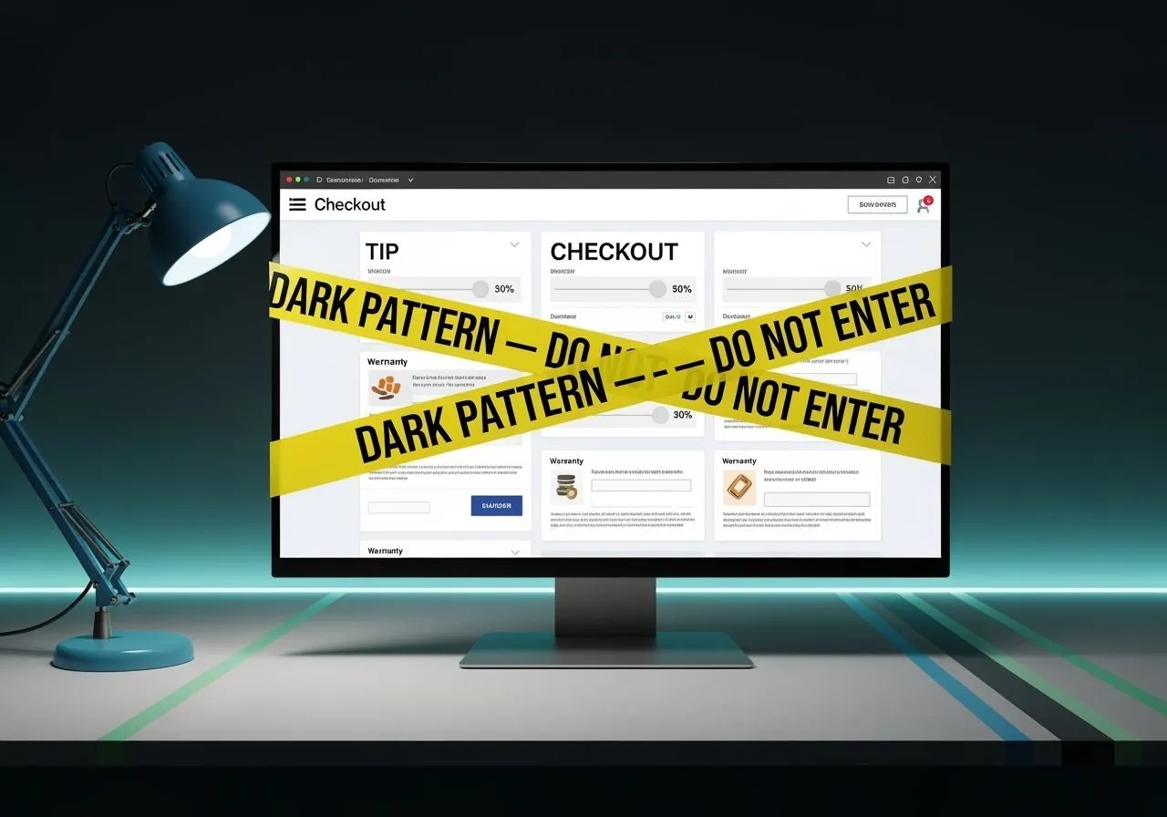
Checkout page where tips default to 20–30% for non-service goods.
If you tick three squares, take the recording. You’ve got a case.
What Honest UX Looks Like (so you can contrast)
Symmetric choices: Accept and Decline equally visible, equal taps.
Neutral copy: No guilt trips, no double negatives.
Reversible by default: Refund/cancel flows are discoverable and short.
Transparent pricing: Fees shown up front; totals stable across steps.
No soft locks: You can navigate without pop-under ambushes.
The Two-Minute Decision Tree
One red flag? Note it; proceed.
Two+ red flags? Record the flow; take price and copy screenshots.
Money on the line? Check for reversibility before committing: refunds, cancel path, “trial becomes paid” date.
Not fixable? Close the tab and name the pattern in your post: “Roach Motel + Confirmshaming.”
“Call It Clean” Script (for your post, support ticket, or tweet)
- I tried to [action]. The interface used [pattern]:
- – Evidence: [screenshot/recording link], [time to complete], [copy pasted].
- – Harm: Extra charges / wasted time / data I didn’t intend to share.
- – Fix: Make Decline equal to Accept in visibility and steps; remove pre-checked add-ons; show total upfront.
- Proof, not vibes.
FAQ (because someone will ask)
“Isn’t this just clever marketing?”
No. Clever marketing persuades you to choose. Dark patterns make not choosing cost more than you expected.
“But everyone does it.”
“Everyone” is not a defense; it’s an indictment. If the flow only works when you’re confused, it isn’t product-market fit—it’s confusion-market fit.
“Can I avoid them?”
Yes: reader mode, disable third-party scripts, say no once then close the tab. But the point is to name it so they fix it—or lose you.
You’ve got the labels and the tools. Next time a flow detours you, run the 90-second test, grab the stills, paste the microcopy, and file it: support ticket, public post, or regulator—your pick. If they fix it, awesome. If they don’t, close the tab and spend elsewhere. Confusion isn’t a funnel; it’s a tax—and you don’t have to pay it.
Read our editorial values and why we ditched a comment policy.